Energy @ ITP
Interaction design, Programming
Tools Used : node.js, heroku, Inkscape
In collaboration with Viniyata Pany
A set of interactive tools to inspect the energy consumption at the Interactive Telecommunications department at NYU.
Energy at ITP - Wall Installation
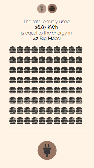
This wall installation is a simple dashboard that explains the energy consumption on the department floor, currently as well as over the past week. The aim of this is two-fold; make people aware of the energy that is being consumed per room/per equipment, and contextualize energy as a fun and tangible concept. To do so, we compare energy used in the building to energy in a potato or energy to use a hair dryer. This project was exhibited at the ITP Spring Show in 2016.
The data for this was obtained from Enertiv.
Energy at ITP - mobile
This mobile app informs users about the energy usage in key rooms/areas in ITP.

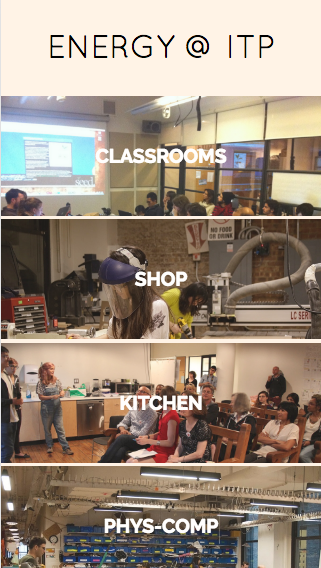
On selecting a room, the power consumption over the last 24 hours is visible along with the breakdown of energy usage by equipment in that room.
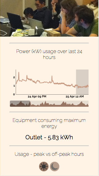
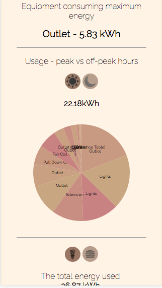
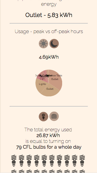
To make the concept of energy a little lighter, there is also a comparision of energy consumption with the energy in big macs and in CFL light bulbs.
← Back to Home