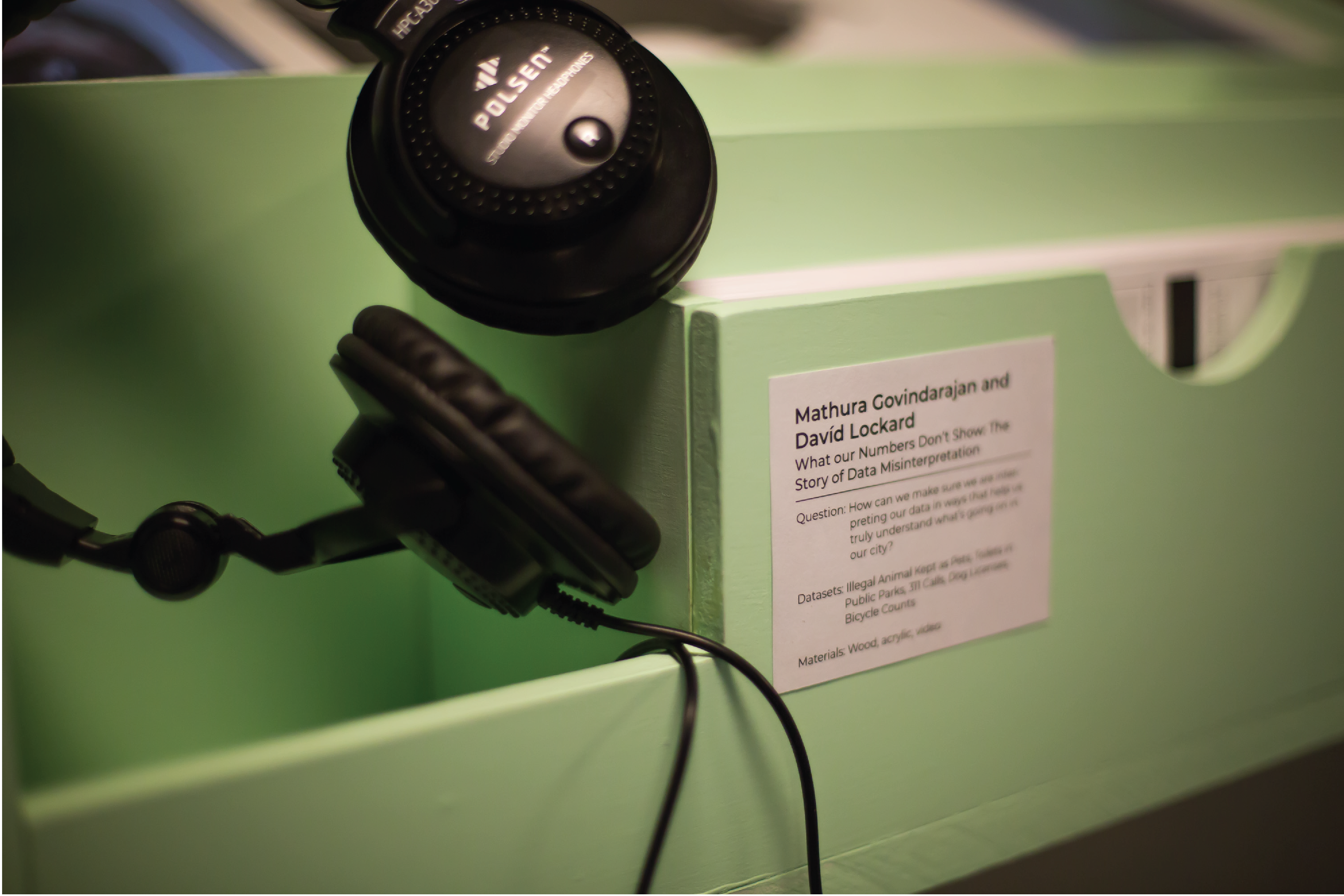
What our Numbers Don't Show: the Story of Data Misinterpretation
fabrication, physical computing, interaction design
How can we make sure we are interpreting our data in ways that help us truly understand what’s going on in our city?
An installation that uses data to tell a story about how we tell our stories. It was created with David Lockard, for the Data Through Design exhibition, part of NYC Open Data Week.
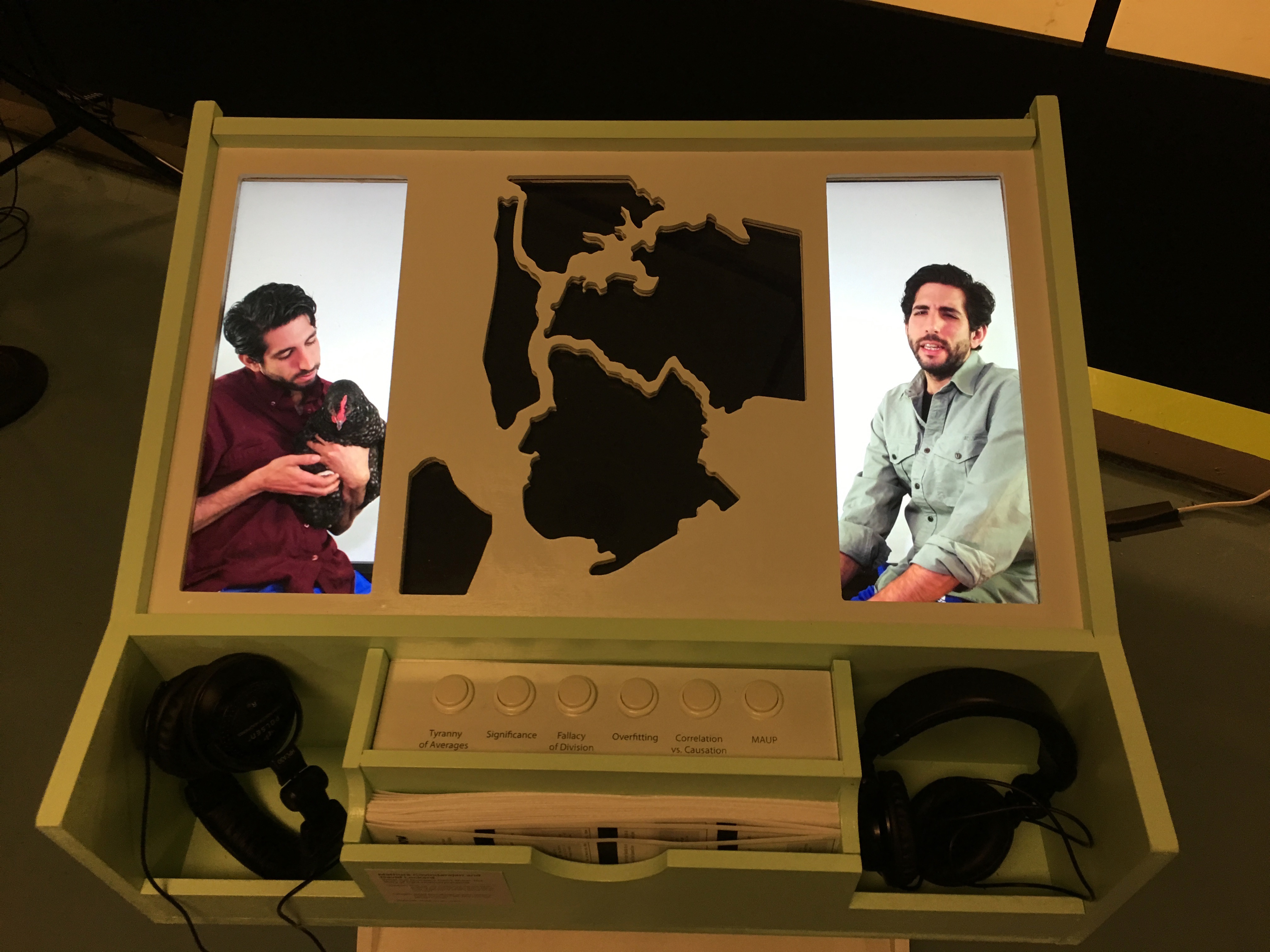
An interactive, freestanding physical station, we humorously ‘misused’ several NYC municipal datasets to illustrate ways in which data is commonly misinterpreted. By presenting the audience with a series of blatantly absurd deductions based on valid data, as well as an explanation of the methodological errors involved, this piece provides the audience with an introduction to key concepts of data analysis such as correlation vs. causation, bias, overfitting, and statistical anomalies. By employing tangible interaction, engaging humor and a clear, welcoming interface, we seek to encourage visitors to listen closely to how the stories we are told (and tell ourselves) about the city and the people in it are constructed - as well as the importance of maintaining a critical view toward these stories.
Images by Samantha Hyatt
NYC Open Data Week is a city-wide endeavor by the NYC Mayor’s Office of Data Analytics, aimed at encouraging a wider knowledge of New York City’s open datasets and how these resources can enable better public understanding of life in the city.
← Back to Home